
 Tim Kencang.in
A standard black-and-white QR code works, but it is not inviting. QR codes with brand colors, a centered logo, and a frame saying "Scan for menu" have been shown to get more scans. The challenge is that every added design element can affect readability. This article summarizes the rules we apply in Kencang.in's QR editor to keep the result attractive and readable on every phone.
How QR codes stay readable even when "damaged"
QR codes have built-in error correction based on the Reed-Solomon algorithm. There are four levels: L (around 7% of data can be lost), M (15%), Q (25%), and H (30%). Higher levels add more redundant modules, so the QR code stays readable even when partly covered by a logo or scratched. The trade-off is a denser matrix. Read a technical explanation of error correction in the Reed-Solomon article on Wikipedia. Kencang.in automatically uses level H when you add a logo.
1. Color: contrast is everything
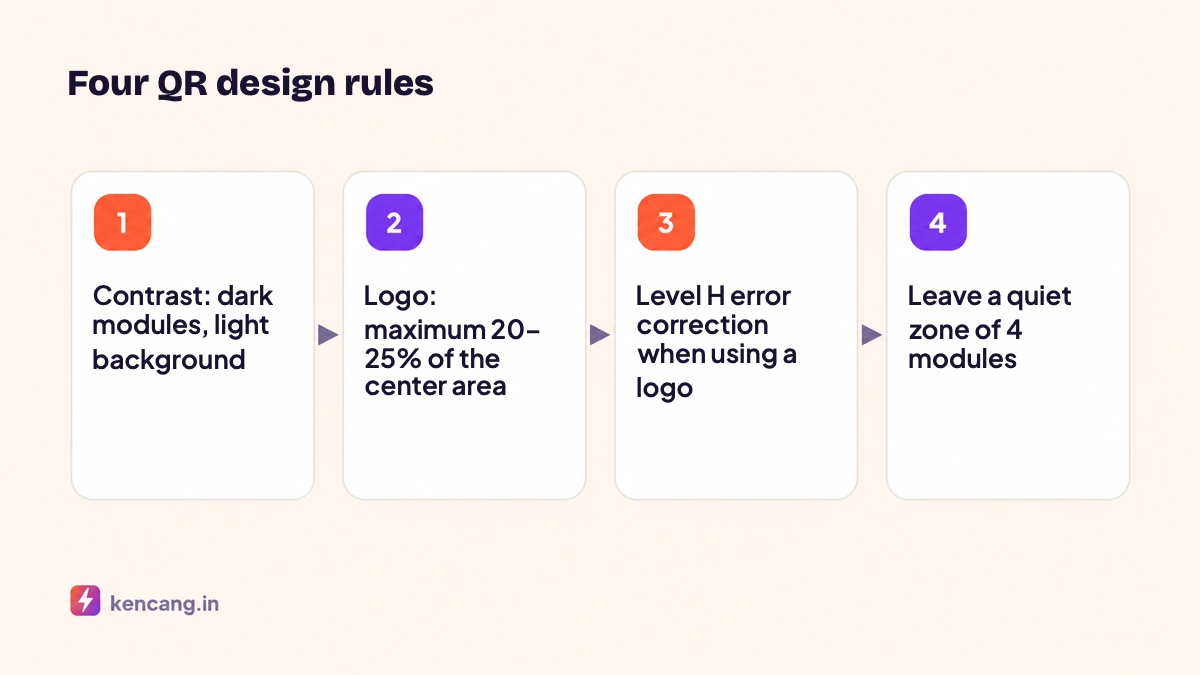
- Modules (squares) must be darker than the background. Many scanners cannot read inverted colors, such as white modules on a black background.
- Minimum contrast ratio 4:1. Dark blue on white is safe; yellow on white is not.
- Gradients can be used as long as both ends of the gradient remain dark. The Kencang.in editor supports two-color gradients for modules.
- Avoid image backgrounds behind the QR code.
2. Logo in the middle
A logo covers some modules, and error correction "patches" that area. To keep it safe:
- Limit the logo to 20-25% of the QR code's area. Our editor automatically enforces the maximum size.
- Give a white background (padding) around the logo so that it doesn't blend in with the module.
- Use a simplified version of the logo; fine details are not visible at small sizes.
- Do not cover the three large corner squares (finder patterns). These orientation markers must remain visible.
3. Module and eye shapes
Circular, rounded, or dot-shaped modules give a modern appearance without reducing readability, provided each module stays a consistent size. The eyes (the three corner squares) can also be rounded. Avoid shapes that are too small, such as stars, because they reduce each module's dark area.
4. Frame and call to action
Frames with text such as "Scan for a discount" increase scans by giving people a reason. Place the text outside the QR area, not over it, and keep the quiet zone (an empty area at least 4 modules wide around the QR code) inside the frame. Kencang.in offers several frame styles with editable text.
5. Size and scanning distance
Rule of thumb: a QR code's side length should be about one tenth of the scanning distance. Use a 2,5 cm QR code for scanning from 25 cm (packaging, tables), and a 20 cm QR code for a poster scanned from 2 meters. A brief short-link alias creates a less dense matrix that handles small sizes better. This is one reason we recommend custom aliases that are short, and why dynamic QR codes are easier to scan than static QR codes containing long URLs.
6. File format
For print, download SVG or PDF for sharpness at any size. For digital (websites, presentations, stories), PNG or WebP is sufficient. Kencang.in provides all four of these formats.
7. Test before mass printing
- Print one sample at actual size and on the same material.
- Scan with at least three different phones (an iPhone, a mid-range Android, and an older Android) in normal and dim lighting.
- Scan from your maximum expected distance.
- Check that the destination is correct; with a dynamic QR code, you can point to a test page first, then change the destination at launch without reprinting.
Implementation example
A café prints a dark-brown dynamic QR code with its logo in the center and a "View menu" frame. When prices rise, they simply change the destination in the dashboard. From the analytics dashboard, they know which tables get the most scans because every table uses a different alias. You can try all of this in the QR Codemenu; find the QR quota for each plan on the pricingpage.
Frequently asked questions
How big of a logo is still safe?
Limit the logo to around 20 to 25 percent of the QR code's area and keep the three large corner squares uncovered. The Kencang.in editor automatically uses level H error correction and enforces a maximum logo size to keep the QR code readable.
Can QR codes use colors other than black?
Yes, as long as the module is darker than the background with a contrast ratio of at least 4:1. Dark blue, dark green, or dark brown on white are safe. Avoid bright colors like yellow or pastels for modules, and don't invert the colors.
Which file format should I send to the print shop?
SVG or PDF, because they are vector and remain sharp at any size. PNG is sufficient for digital uses such as websites, presentations, or stories. Kencang.in provides all these formats in the download menu.
How can I check readability before bulk printing?
Print a sample on the actual material at the intended size, then scan it with several different phones in normal and dim lighting from the expected distance. With a dynamic QR code, point it to a test page first and change its destination when the campaign starts.